75+ Best Serif Fonts
Bring a classic touch to your designs with our serif fonts. Known for their small lines or strokes attached to larger strokes, these fonts are perfect for printed materials, formal documents, or any design requiring a traditional feel.

Minty March Condensed Font
This is the type of font that you usually see on greeting cards and wedding invitations. Minty March is a condensed font that also doubles as a serif ...

Caringin Creative Vintage Font
Caringin is an elegant vintage font that’ll look great on a bottle label or a badge for an alcohol brand. The font features a creative serif des...

Galvin Slab Serif Font Family Pack
Galvin is a complete slab serif font family that comes with 8 different weights ranging from regular, outline, thin, and bold. The condensed design of...

Ocean Twelve Unique Serif Font
Modeled after the 90s style typography usually seen on flyers, posters, and book covers, Ocean Twelve is a modern serif font that will give your desig...

Jerrick Serif Font Family
Jerrick is a modern serif fonts family that include 6 different typefaces ranging from regular to bold and italics. The font features both uppercase a...
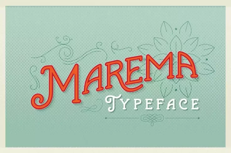
Marema Gothic Typeface
Marema is a stunning retro-vintage font that will transport you back in time with its gothic design elements. The font has a unique, creative flow tha...

Midtown Groveed a Modern Serif Font
You can use this font to design modern and urban-style titles and headings for your projects. The font includes regular, bold, and outline styles that...

Lansdowne Vintage Serif Font
Lansdowne is a perfect candidate to quench your thirst for a vintage, classic font. An all-caps, slanted typeface, Lansdowne packs a powerful punch an...
FAQs About Serif Fonts
What are Serif Fonts?
Serif fonts, also known as Roman fonts, are a style of font that feature small lines or strokes attached to the ends of larger lines in the letters, symbols or numbers. This style is one of the oldest known typefaces and has been used since the Roman era.
The word 'serif' originates from the Dutch term 'schreef', meaning 'line' or 'pen stroke'. It represents a traditional and classical style and is most commonly used in printed materials due to its sharp contrast and high readability on paper.
What are some examples of Serif Fonts?
There are many serif fonts that are widely used and recognized. Some of the more popular ones include Times New Roman, Georgia, Garamond, Baskerville, and Palatino. Each of these fonts has its own unique characteristics and styles, but all feature the distinctive flourishes or 'serifs' at the ends of their strokes.
These fonts are often used in formal or professional documents, such as academic papers, newspapers, books, and legal documents due to their traditional style and high readability.
How do Serif Fonts affect the readability of text?
One of the main effects of using serif fonts is that it can enhance the readability of text, especially in printed materials. The little 'feet' or serifs at the end of strokes can make letters more distinctive and easier to recognize. This can help guide the eye along lines of text, improving reading speed and reducing eye fatigue.
However, on low-resolution screens, these serifs can sometimes found hard to display, making the text harder to read. In these cases, sans-serif fonts, which lack these additional strokes, are often a better choice.
Can Serif Fonts be used in web design?
Yes, serif fonts can be used in web design. While they were once shunned for their poor readability at smaller sizes on low-resolution screens, advancements in screen technology as well as the advent of font smoothing technology such as anti-aliasing have made serif fonts much more suitable for use in digital environments.
But keep in mind, readability is crucial in web design, so making the right choice between serif and sans-serif fonts, considering the nature of your content and the overall aesthetic of your website, is of utmost importance. Comments and feedback from users can also be helpful in deciding which font style is most suitable.
What’s the difference between Serif and Sans-Serif Fonts?
The main difference between serif and sans-serif fonts lies in the small decorative lines attached to the ends of strokes in serif fonts. 'Sans' is French for 'without', so a sans-serif font simply means a font without serifs. Serif fonts tend to appear more elaborate and traditional, while sans-serif fonts look simpler and more modern.
Furthermore, while serif fonts tend to be easier to read in print, sans-serif fonts are typically considered more legible on-screen, especially at smaller sizes or lower resolutions. However, with increasing screen resolutions and improving display technologies, the gap between these two typefaces is narrowing.