50+ Best Slab Serif Fonts
Give your designs a strong foundation with our slab serif fonts. Known for their thick, block-like serifs, these fonts are perfect for headlines, posters, or any design that requires a bold, assertive touch.

Slabtro Slab Serif Display Font
Introducing Slabtro, a slab serif display font with a healthy dose of retro flair. Known for its robust, bold strokes, and delightful characters embel...

Boxing Vintage Slab Serif Font
Featuring a bold retro design, this slab serif font comes with a set of all-caps letters. It’s most suitable for making titles and headings for ...
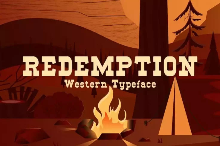
Redemption Wild Western Font
Redemption is a creative slab-serif font with a wild west look and feel. It also has classic cowboy-style letter designs that will make your designs s...

Korsen Modern Slab Serif Font
Korsen is a unique slab serif font that features a modern design with stylish decorative elements. The font is perfect for crafting logos, labels, and...

Troupe Slab Font
This unique font features slab serifs with a fun and quirky design. The font is most suitable for T-shirt designs, greeting cards, and other print and...
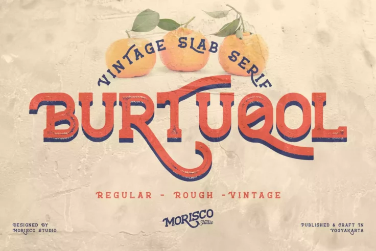
Burtuqol Vintage Slab Serif Font
Bring a vintage charm to your designs with Burtuqol, a gorgeous slab serif font perfect for a range of branding and packaging projects. It comes packe...
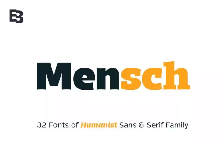
Mensch Slab Serif Font Family
With more than 30 different fonts to choose from, Mensch is a big family of fonts you can use with various design projects. It includes both serif and...

Blade Slab Serif Font
Blade is a horror-themed slab serif font that comes with a unique design that’s most suitable for horror-themed movie posters, book covers, gree...

Mutone Classic Slab Serif Font
Mutone is a classic vintage slab serif font perfectly fitting for a range of design projects from logos, posters, signs, to cover titles, and headline...

Manson Vintage Slab Serif Font
Manson Vintage Slab Serif Font is a showcase of traditional typography with a remarkable modern twist. Its inspiration came from the sturdy and imposi...
FAQs About Slab Serif Fonts
What are Slab Serif Fonts?
Slab Serif Fonts, also known as Mechanistic, Square Serif, or Egyptian, are a type of serif font characterized by thick, block-like serifs. Serifs are the small lines or strokes that extend from the ends of the main strokes of a letter in a font. In contrast to more typical, delicate serif fonts, the serifs in Slab Serif fonts are typically as heavy as the line width of the letters themselves.
The design originated during the Industrial Revolution in the 19th century, and is known for its use in headlines and display text rather than body content. This is due to their bold impact, making them suitable for grabbing the reader's attention.
What are the common uses of Slab Serif Fonts?
Given their bold and impactful design, Slab Serif fonts are mainly used in headlines, display texts, logos, and titles. They are typically not used in body text or for small point sizes, as the heaviness of the font can make text difficult to read. However, in larger sizes, it can be utilized to create strong emphasis and stand out in designs.
Slab Serif fonts are also favored for their versatility and can be seen in various styles ranging from retro, modern or even rustic depending on the particular font used.
What is the difference between Slab Serif and other Serif Fonts?
The main difference between Slab Serif and other Serif fonts lies in the construction of the serifs. Traditional Serif fonts, like Times New Roman and Georgia, have delicate, thinner serifs that extend off the main strokes of a character. On the other hand, Slab Serif fonts feature thick, heavy serifs that are block-like in appearance and often carry the same weight as the line thickness of the characters.
Further, Slab Serif fonts are more distinctive and attention-grabbing than their Serif counterparts. They are typically used for headers or titles rather than body content where a more readable font like a traditional Serif would be used.
Who designed the first Slab Serif Font?
The first Slab Serif font, often referred to as the "Egyptian" style, was designed by Vincent Figgins in 1815. Figgins was a British type founder, who created the font as a response to the increasing need for advertising, poster fonts during the Industrial Revolution. These fonts needed to be bold and visible for use in signage and posters.
The term "Egyptian" was used to describe these fonts due to the prevailing Western fascination with Ancient Egypt during that period, although the font style itself doesn't have a true connection with Egyptian writing systems.
Are Slab Serif Fonts considered modern or vintage?
While the origin of Slab Serif Fonts dates back to the 19th century, these fonts can be seen as both vintage and modern. With their appearance in the industrial revolution and frequent use in the 19th century, they carry a vintage feel. However, their bold, striking characteristics give them a contemporary edge as well, making them a versatile choice for both modern and retro design projects.
Moreover, there are quite a number of newer Slab Serif typefaces which are designed with a modern twist, keeping them relevant and appealing for current graphic design standards and trends.