75+ Best Serif Fonts
Bring a classic touch to your designs with our serif fonts. Known for their small lines or strokes attached to larger strokes, these fonts are perfect for printed materials, formal documents, or any design requiring a traditional feel.

Clab Modern Slab Serif Font
This font is the perfect example of a slab serif font. It has a chunky letter design with thick serifs. Making it a great choice for designing attract...
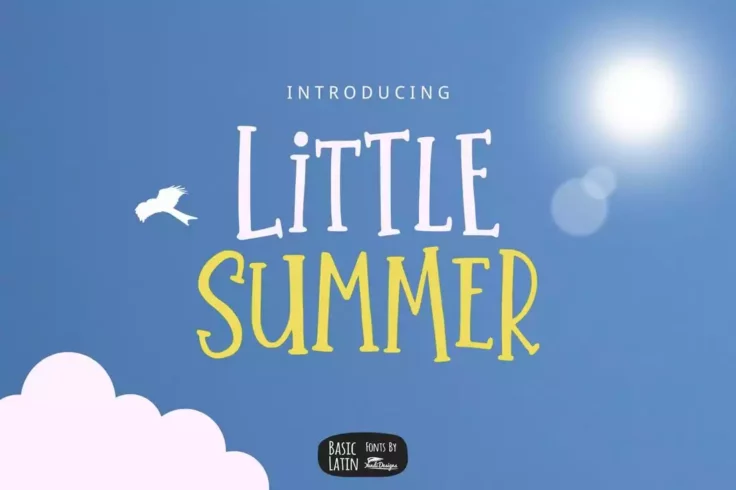
Little Summer Creative Serif Font
This fun and quirky serif font is perfect for designing creating greeting cards and book covers, especially related to kids and fun activities. The fo...

Legalitere Luxury Serif Font
This modern serif font comes with a luxurious design. It’s perfect for creating labels, logos, and titles for your high-end product and branding...
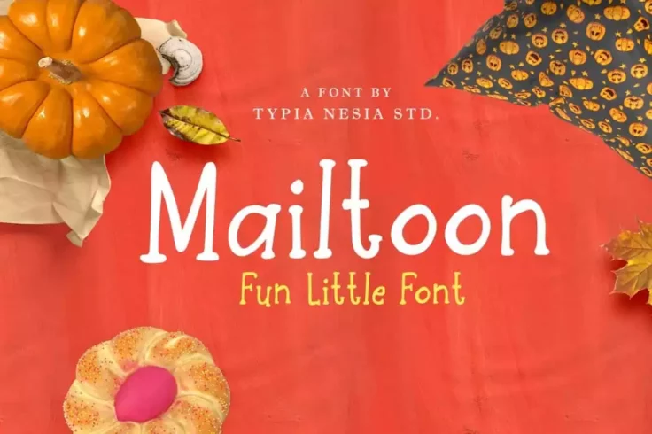
Mailtoon Fun Serif Font
If you’re looking for a fun and quirky serif typeface, Mailtoon is the perfect font for you. It features a creative design that will allow you t...
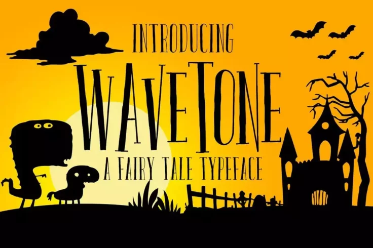
Wavetone Serif Font
Wavetone is a creative serif font that you would use to design a book cover, poster, greeting card, or a flyer. Inspired by classic ads and movie post...
FAQs About Serif Fonts
What are Serif Fonts?
Serif fonts, also known as Roman fonts, are a style of font that feature small lines or strokes attached to the ends of larger lines in the letters, symbols or numbers. This style is one of the oldest known typefaces and has been used since the Roman era.
The word 'serif' originates from the Dutch term 'schreef', meaning 'line' or 'pen stroke'. It represents a traditional and classical style and is most commonly used in printed materials due to its sharp contrast and high readability on paper.
What are some examples of Serif Fonts?
There are many serif fonts that are widely used and recognized. Some of the more popular ones include Times New Roman, Georgia, Garamond, Baskerville, and Palatino. Each of these fonts has its own unique characteristics and styles, but all feature the distinctive flourishes or 'serifs' at the ends of their strokes.
These fonts are often used in formal or professional documents, such as academic papers, newspapers, books, and legal documents due to their traditional style and high readability.
How do Serif Fonts affect the readability of text?
One of the main effects of using serif fonts is that it can enhance the readability of text, especially in printed materials. The little 'feet' or serifs at the end of strokes can make letters more distinctive and easier to recognize. This can help guide the eye along lines of text, improving reading speed and reducing eye fatigue.
However, on low-resolution screens, these serifs can sometimes found hard to display, making the text harder to read. In these cases, sans-serif fonts, which lack these additional strokes, are often a better choice.
Can Serif Fonts be used in web design?
Yes, serif fonts can be used in web design. While they were once shunned for their poor readability at smaller sizes on low-resolution screens, advancements in screen technology as well as the advent of font smoothing technology such as anti-aliasing have made serif fonts much more suitable for use in digital environments.
But keep in mind, readability is crucial in web design, so making the right choice between serif and sans-serif fonts, considering the nature of your content and the overall aesthetic of your website, is of utmost importance. Comments and feedback from users can also be helpful in deciding which font style is most suitable.
What’s the difference between Serif and Sans-Serif Fonts?
The main difference between serif and sans-serif fonts lies in the small decorative lines attached to the ends of strokes in serif fonts. 'Sans' is French for 'without', so a sans-serif font simply means a font without serifs. Serif fonts tend to appear more elaborate and traditional, while sans-serif fonts look simpler and more modern.
Furthermore, while serif fonts tend to be easier to read in print, sans-serif fonts are typically considered more legible on-screen, especially at smaller sizes or lower resolutions. However, with increasing screen resolutions and improving display technologies, the gap between these two typefaces is narrowing.