50+ Best Slab Serif Fonts
Give your designs a strong foundation with our slab serif fonts. Known for their thick, block-like serifs, these fonts are perfect for headlines, posters, or any design that requires a bold, assertive touch.

Clab Modern Slab Serif Font
This font is the perfect example of a slab serif font. It has a chunky letter design with thick serifs. Making it a great choice for designing attract...
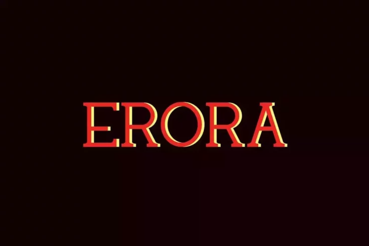
Erora Slab Font
Erora is a slab serif font that supports both print and web design works. The font is suitable for website headers, social media covers, logo design, ...

Simple Note Minimal Slab Serif Font
Just as the name suggests, this font comes with a simple and clean letter design that will fit in perfectly with any professional design. It’s e...

Grante Slab Serif Display Font
Presenting the Grante Slab Serif Display Font, a unique font designed to add a touch of charm and sophistication to your creative projects, both digit...

Disway Slab Serif Stencil Font
Introducing Disway Slab Serif Stencil Font, a bold and dynamic modern font. Designed to make an assertive statement, this font conjures an air of auth...

Calvin Slab Serif Font Family
Calvin is a stylish slab serif font that comes with a modern design. This font is perfect for all kinds of creative and professional designs from logo...

Karens Bold Slab Serif Foont
Karens Bold Slab Serif Font is an intricately-designed font bundle that brings out an uncommon blend of modern and elegance in every stroke, perfect f...
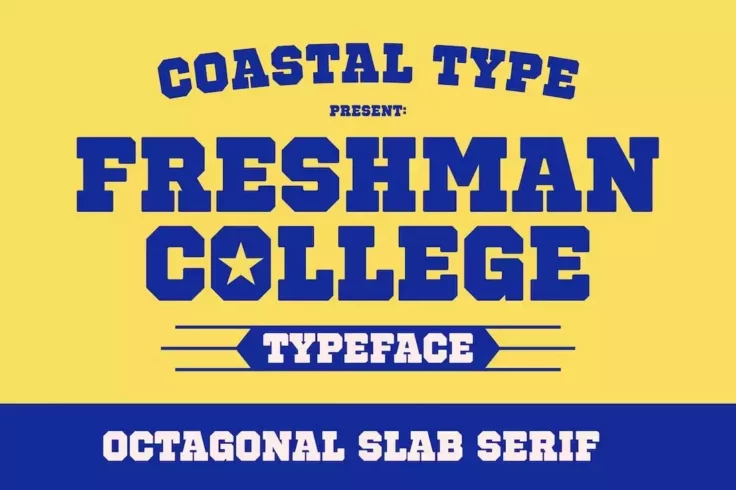
Freshman College Ocatagonal Slab Serif Font
The college sports style design of this font makes it a great choice for designing logos, titles, and headings for football and baseball-themed design...

Mutone Classic Slab Serif Font
Mutone is a classic vintage slab serif font perfectly fitting for a range of design projects from logos, posters, signs, to cover titles, and headline...
FAQs About Slab Serif Fonts
What are Slab Serif Fonts?
Slab Serif Fonts, also known as Mechanistic, Square Serif, or Egyptian, are a type of serif font characterized by thick, block-like serifs. Serifs are the small lines or strokes that extend from the ends of the main strokes of a letter in a font. In contrast to more typical, delicate serif fonts, the serifs in Slab Serif fonts are typically as heavy as the line width of the letters themselves.
The design originated during the Industrial Revolution in the 19th century, and is known for its use in headlines and display text rather than body content. This is due to their bold impact, making them suitable for grabbing the reader's attention.
What are the common uses of Slab Serif Fonts?
Given their bold and impactful design, Slab Serif fonts are mainly used in headlines, display texts, logos, and titles. They are typically not used in body text or for small point sizes, as the heaviness of the font can make text difficult to read. However, in larger sizes, it can be utilized to create strong emphasis and stand out in designs.
Slab Serif fonts are also favored for their versatility and can be seen in various styles ranging from retro, modern or even rustic depending on the particular font used.
What is the difference between Slab Serif and other Serif Fonts?
The main difference between Slab Serif and other Serif fonts lies in the construction of the serifs. Traditional Serif fonts, like Times New Roman and Georgia, have delicate, thinner serifs that extend off the main strokes of a character. On the other hand, Slab Serif fonts feature thick, heavy serifs that are block-like in appearance and often carry the same weight as the line thickness of the characters.
Further, Slab Serif fonts are more distinctive and attention-grabbing than their Serif counterparts. They are typically used for headers or titles rather than body content where a more readable font like a traditional Serif would be used.
Who designed the first Slab Serif Font?
The first Slab Serif font, often referred to as the "Egyptian" style, was designed by Vincent Figgins in 1815. Figgins was a British type founder, who created the font as a response to the increasing need for advertising, poster fonts during the Industrial Revolution. These fonts needed to be bold and visible for use in signage and posters.
The term "Egyptian" was used to describe these fonts due to the prevailing Western fascination with Ancient Egypt during that period, although the font style itself doesn't have a true connection with Egyptian writing systems.
Are Slab Serif Fonts considered modern or vintage?
While the origin of Slab Serif Fonts dates back to the 19th century, these fonts can be seen as both vintage and modern. With their appearance in the industrial revolution and frequent use in the 19th century, they carry a vintage feel. However, their bold, striking characteristics give them a contemporary edge as well, making them a versatile choice for both modern and retro design projects.
Moreover, there are quite a number of newer Slab Serif typefaces which are designed with a modern twist, keeping them relevant and appealing for current graphic design standards and trends.